
 All
All Culture


 Choi Ji-su & Lee Joo-yeon

Trends are always changing very fast. This year, various industries are interested in ‘it’. Fashion, hair, makeup and interior design are using ‘it’. It is the ‘Pantone color of the year’. Visual design plays an important role in catching people’s eyes. The Pantone color of the year is also leading a trend in relation to visual design. Let’s find out what the Pantone color of the year is and how to use it. -Ed.
What is the Pantone color of the year?
Since a few years ago, the Pantone color of the year has been utilized in many industries. Even though many people know it is used in some parts of fashion or makeup, they are usually indifferent about this. However, its popularity increased rapidly last year. In 2016, since the Pantone color of the year became famous, there have been a lot of things that used the color.
Pantone is a company specializing in making colors, and it has announced its color of the year annually. Pantone is well known for its Pantone Matching System, which makes each color’s own codes. Pantone’s color of the year program started in 2000, and they announce the next year’s color every December. The Pantone color of the year has a great influence on fashion, interior design and cosmetics. It also creates a new color trend.
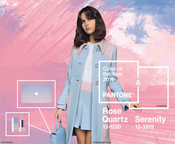
Colors of the year for 2016: Rose Quartz and Serenity
Since 2011, the Pantone color of the year has become famous. Let’s take a look through the Pantone colors of the year from 2011 to 2016. The Pantone color of the year in 2011 was Honeysuckle, which is a hot pink. The color of the year in 2012 was Tangerine Tango, and Emerald was the color of 2013. 2014’s color was Radiant Orchid, which is a purple, and the Pantone color of the year in 2015 was Marsala, which is a red. Finally, what is the Pantone color of the year for 2016? For the first time, Pantone introduced two shades, Rose Quartz and Serenity, as the Pantone colors of the year 2016, which are a pastel pink and a blue respectively.
Then, what is the reason Pantone chose Rose Quartz and Serenity as the colors for 2016? First, Pantone said, “As consumers seek for mindfulness and well-being as an antidote to modern day stresses, welcoming colors that psychologically fulfill their yearning for reassurance and security are becoming more prominent.” In this context, Rose Quartz and Serenity are the comfortable colors that appease our cravings.
Pantone said about the colors of the year 2016, “Rose Quartz is a persuasive but gentle tone, which conveys compassion and a sense of composure. Serenity is weightless and airy, like an expanse of the blue sky above us, bringing feelings of respite and relaxation even in turbulent times.”
Second, in many parts of the world, we are experiencing a gender blur as it relates to fashion and color. The Pantone color of the year 2016 considered gender equality and a color’s autonomy through the combination of Rose Quartz and Serenity.
Using the Pantone color of the year
Pantone’s color of the year is powerful in many types of industries. In this regard, Pantone explained how they know the latest color trend better than anybody else by saying, “Color plays an important role in promoting products. It defines a space and creates an atmosphere like a magic. Moreover, it inspires you to choose a perfect color in all design markets through Pantone’s various trend predictions. We provide detailed and overall data about colors, and the chosen color utilizes various industries like women, men, outdoor, cosmetics, interior and industrial designs.”
Actually, a lot of industries use the Pantone color of the year and lead the trend. First, fashion and cosmetics are very sensitive to colors. In the fashion field, various brands have launched products using the Rose Quartz and Serenity. These colors remind us of spring, so we can find these colors in the 2016 Spring/Summer collections. Moreover, the cosmetics field also launches products using the Pantone color of the year 2016. In particular, Pantone and VDL’s collaboration was remarkable. It is famous among women because products that use the Rose Quartz and Serenity attracted much attention.
Tips for using the Pantone color of the year
Not only using the Pantone color of the year but also knowing how and where to adjust these colors are also important. Pick a product and match it with a harmonious color, but don’t spread the color all over the place in order to follow the trend. Pantone says that the colors of this year are attractive on any material, such as matte, metallic, glossy, etc., and they are easy to pair with mid-tone colors including green, purple, dark brown, yellow and pink. Why don’t you try using the colors that will make you brilliant and trendy?
By Choi Ji-su
js36@cbnu.ac.kr
By Lee Joo-yeon
jy37@cbnu.ac.kr


 Quick News


